Content
Row: how to change layout and colors?
Icon boxes: available types and how to use them?
This shortcodes lets you add an many variations of icon box to your page:
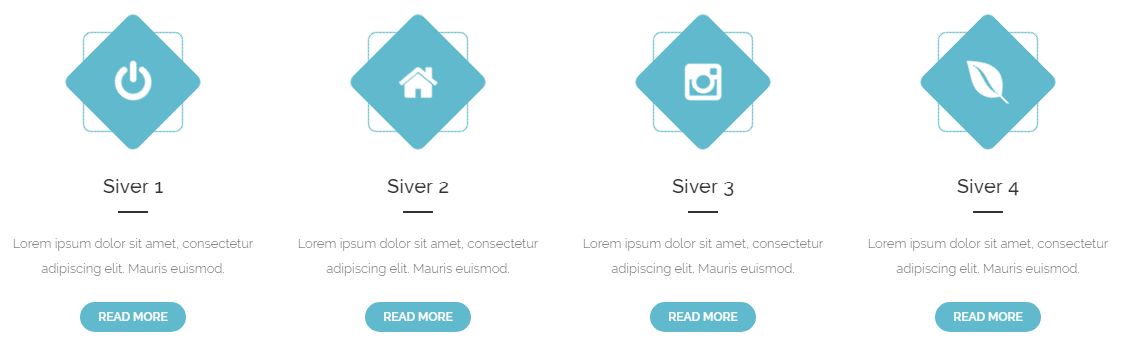
Iconbox
Back-end
Front-end
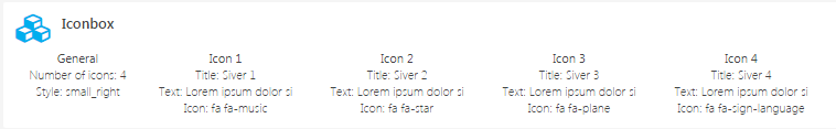
General Tab
- Number of icons: Set the number of icon boxes from 1 to 4 that will be show in single row
- Style: Choose one of the avaliable styles of Icon Box
- Small Left Aligned Icon Style
- Small Right Aligned Icon Style
- With background left aligned Style
- With background right aligned Style
Icon 1 Tab
In the content tab, you can set the content of this item.
- Title: Insert the title for your Icon Box.
- Text: Insert text that will be shown in your Icon Box.
- Icon: Here you have a list of the entire collection of Font Awesome icons.
Icon box Big Style
Back-end
Front-end
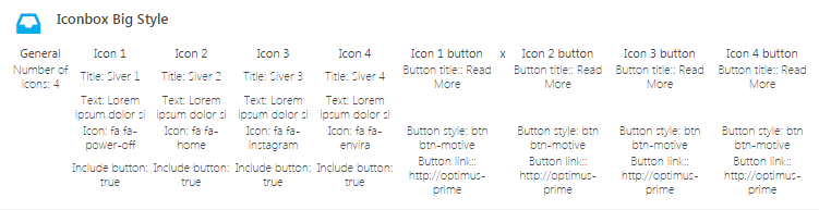
General Tab
- Number of icons: Set the number of icon boxes from 1 to 4 that will be show in single row
Icon 1 Tab
In the content tab, you can set the content of this item.
- Title: Insert the title for your Icon Box.
- Text: Insert text that will be shown in your Icon Box.
- Icon: Here you have a list of the entire collection of Font Awesome icons.
- Include button:
check Yesif you want to use button for this Icon box
Icon 1 Button
The button will be only visible if it will be included
- Button title: Insert the title for your Icon Box.
- Button size:
- Extra small
- Small
- Default
- Large
- Button style: Lets you select your Icon Box style.
- Motive
- Motive dark hover
- Motive transparent
- Motive transparent, dark text
- Light
- Light dark hover
- Light transparent
- Light transparent, dark text
- Button link: Insert a link.
Iconbox Counters
Back-end
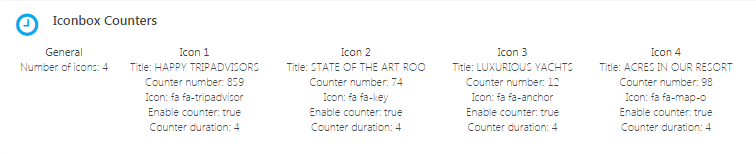
Front-end
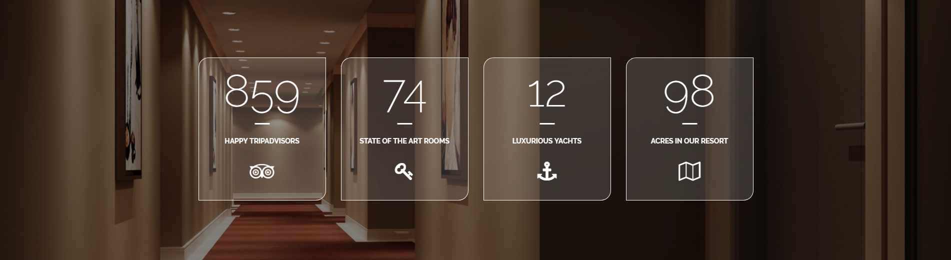
General Tab
- Number of icons: Set the number of icon boxes from 1 to 4 that will be show in single row
Icon 1 Tab
In the content tab, you can set the content and color used for this item.
- Title: Insert the title for your Icon Box.
- Counter number
- Icon: Here you have a list of the entire collection of Font Awesome icons.
- Enable counter:
check Yesif you want to show the counter number - Counter duration
- Select border color: Choose border color of the icon box
- Select background color: Choose background color of the shortcode
- Select title color: Choose the color of the icon box title
- Select counter color: Choose the color of the counter number
- Select icon color: Choose the color of the icon
Info Box
Back-end
Front-end
General Tab
- Number of boxes: Set the number of boxes from 1 to 4 that will be show in single row
Table 1 Tab
In the content tab, you can set the content and color used for this item.
- Background image: Set the image that will be used in the Info Box.
- Title: Insert the title for your Info Box.
- Subtitle: Insert the subtitle that will be visible in the Info Box.
- Include button:
check Yesif you want to use button for the info box shortcode
Table 1 Button Tab
- Button title: Insert title for the button.
- Button size: Choose one of the avaliables button sizes.
- Extra Small
- Small
- Default
- Large
- Button style: Choose one of the styles avaliable for the button.
- Motive
- Motive dark hover
- Motive transparent
- Motive transparent, dark text
- Light
- Light dark hover
- Light transparent
- Light transparent, dark text
- Button link: Insert a link.
Visual Composer Icon Boxes
Icon boxes based on two shortcode’s from Visual Composer: Icon and Text block
Back-end
Front-end
Icon Setting’s General Tab
- Icon library: Choose the library from which you will be avaliable to use icons for this element.
- Font Awesome
- Open Iconic
- Typicons
- Entypo
- Linecons
- Mono Social
- Material
- Icon: Choose the icon from the list.
- Icon color: Set icon’s color from one of the avaliable options.
- Custom color: You can also set a custom color.
- Background shape: Choose shape of the icon background.
- None
- Circle
- Square
- Rounded
- Outline Circle
- Outline Square
- Outline Rounded
- Background color: Choose color of the icon background from one of the avaliables ones.
- Custom background color: You can also set a custom color.
- Size: Choose the size from avaliable options.
- Mini
- Small
- Normal
- Large
- Extra Large
- Icon alignment: Set the align for the icon.
- URL (Link): Insert a link, and choose if it will opens on a new window.
- CSS Animation: Select type of animation for element to be animated when it “enters” the browsers viewport (Note: works only in modern browsers).
- Element ID: Enter element ID (Note: make sure it is unique and valid according to w3c specification).
- Extra class name: Style particular content element differently - add a class name and refer to it in custom CSS.
Text Block Setting’s General Tab
Block text will allow you to edit the text that will be visible on frontend.
Sliders: available types and how to use them?
Revolution Slider
Siver Chefs Slider Shortcode
Image Carousel Shortcode
Siver Trainers Slider Shortcode
Siver Testimonials Slider
Contact Form 7 - contact form and Newsletter form
Contact forms in Siver are created with the use of Contact Form 7 Plugin. Below you will find information how to recreate each Contact forms used in our theme by adding the correct markup for the Form section of this plugin.
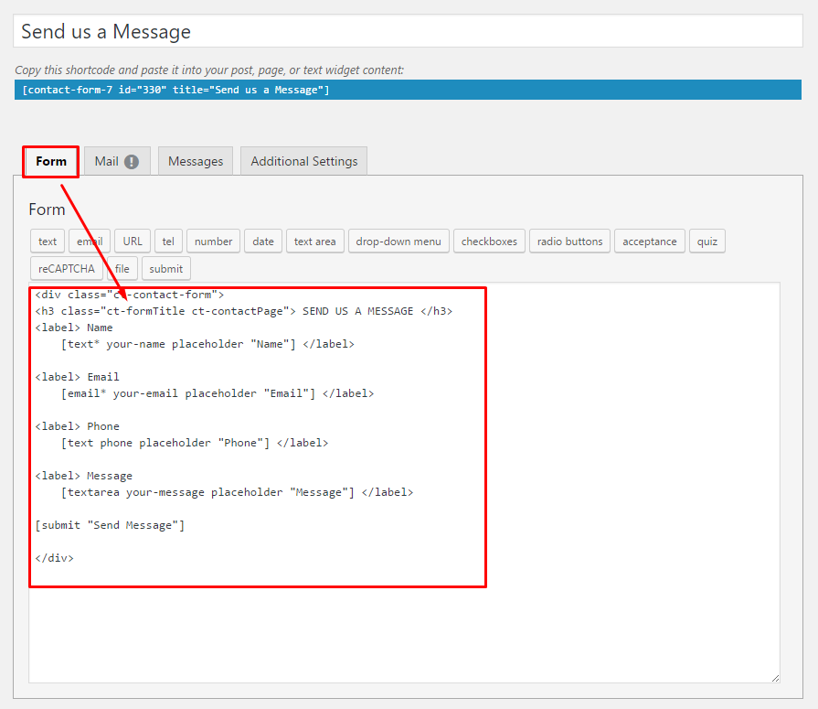
If you never before used this plugin I suggest you to check Getting Started with ContactForm 7.
Page contact
markup:
<div class="form-group text-right"><span class="inner"><label class="sr-only"> Your Name </label> [text* Name placeholder "Name"]<label class="sr-only"> Your Email </label> [email* email placeholder "Email"]<label class="sr-only"> Message </label> [textarea* Email placeholder "Message"]<br><button type="submit" class="btn btn-motive--darkHover btn-full">Send Message</button></span></div>
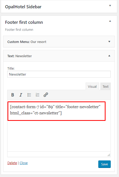
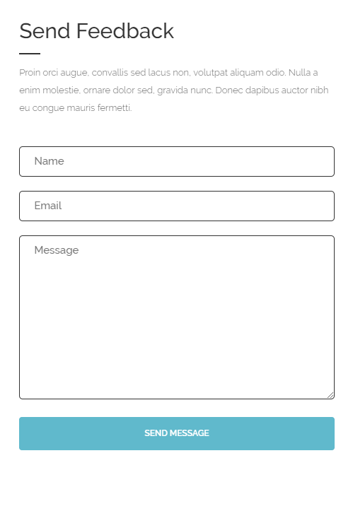
Footer – newsletter
markup:
<div class="form-group"><label> Please enter your email address and hit sign up button. We never spam.</label><span class="inner">[email* your-email placeholder "Your e-mail here"]<button type="submit"><span class="fa fa-long-arrow-right" aria-hidden="true"> <span class="sr-only">Submit</span></span></button></span></div>
In our demo this form is added to the Footer second column in first row widgets via adding this contact form shortcode to text widget as you can see on the image below: